Top 5 Worst Fonts That Instantly Kill Readability
Choosing the right font is essential for any website or design project. Fonts set the tone and shape your brand’s message. A poor choice can confuse your audience or undermine your credibility. Below, we explore the worst fonts ever created, explain why they fail, and share tips for better alternatives.
Learn the top 5 worst fonts and how to avoid the like!
The Importance of Fonts in Web Design
Fonts are the backbone of any design. They:
-
Convey mood and emotion.
-
Guide readers through your content.
A strong font choice adds elegance or a modern feel. The wrong font can look sloppy, feel cheap, or even offend visitors. Always match your font to your brand’s voice.

Why Fonts Go Bad
Fonts become unreadable when they combine excessive styling, poor spacing, overuse, and limited versatility. Too many flourishes distract; tight or loose kerning disrupts flow; cliché system fonts feel lifeless; display faces often break down at small sizes or on mobile.
The Top 5 Offenders
Arial
Originally a Helvetica stand-in bundled with Windows 3.1, Arial’s ubiquity renders it lifeless. It offers no unique character—ideal only for dry corporate reports, never for branding.

Developed in 1982 as a metrically identical stand-in for Helvetica, Arial was bundled with Windows 3.1 and soon became ubiquitous in digital and print contexts. Its neutral, even strokes ensured reliable legibility but offered no unique flair, causing headings and body text to blend together.
Mimicking Helvetica so closely, Arial feels like an uninspired substitute rather than a distinct face. On low-resolution screens and mobile devices, its lack of contrast can cause text to blur, weakening readability.
It is the default typeface in Microsoft Word’s corporate report templates.
Comic Sans MS
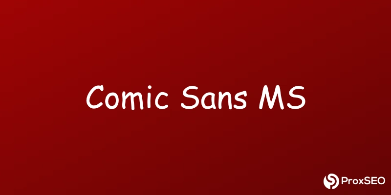
Born in 1994 for Microsoft Bob, its playful shapes suit kids’ materials but clash with professional contexts. Outside youth-oriented uses, it destroys credibility.

Introduced in 1994 by Vincent Connare for Microsoft Bob, Comic Sans MS drew on comic-book lettering to create a friendly, informal vibe. Its rounded, playful shapes made it legible at small sizes, but they also cemented its childish reputation.
Outside youth-oriented contexts, Comic Sans MS signals amateurism and distracts from serious content. It now stands as a design punchline rather than a reliable choice.
It appears on the signage at Seattle Children’s Hospital, where its friendly tone suits a pediatric setting.
Courier New
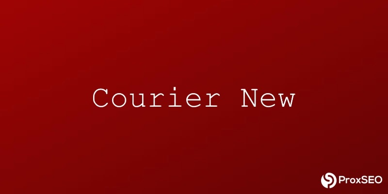
A 1992 monospaced relic of IBM’s 1950s typewriter, Courier New’s rigid spacing makes prose look choppy. Reserve it strictly for code editors or screenplays.

Originating in the 1950s as IBM’s typewriter face and digitized in 1992, Courier New uses uniform, monospaced letters that echo classic mechanical typewriters. While perfect for code editors and screenplays, its rigid spacing disrupts the natural flow of paragraphs.
The equal-width characters make body text look choppy and stilted, drawing undue attention to letter shapes. This mechanical aesthetic undermines readability in continuous prose.
It was the default font in Windows XP’s Notepad application.
Papyrus
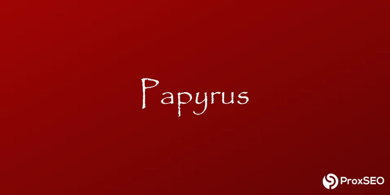
Hand-drawn in 1982 to mimic ancient scrolls, Papyrus screams cliché. Its rough strokes fit “rustic” headlines at best; on most sites, it feels forced and amateurish.

Hand-drawn in 1982 by Chris Costello to mimic ancient manuscripts, Papyrus features rough, irregular strokes that aim for a rustic aesthetic. Its widespread inclusion in macOS and Microsoft Office turned it into a predictable cliché.
What once felt artisanal now reads as amateurish, especially when forced into modern layouts. It headlines the title of James Cameron’s Avatar, where its ancient look clashed with blockbuster branding.
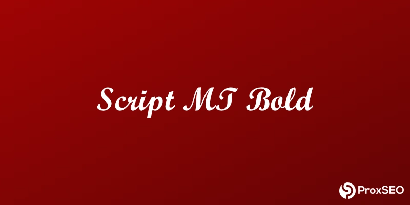
Script MT Bold
With heavy, looping strokes from early-’90s German scripts, it overwhelms body text and loses clarity. Use sparingly for formal event invitations—never in paragraphs.

Digitized in the early 1990s from ornate German scripts, Script MT Bold boasts thick, flowing strokes meant to evoke formality and celebration. In headings or invitations, it adds flourish, but those same heavy loops can overwhelm smaller text.
Within paragraphs or on busy backgrounds, its ornate nature causes letters to fuse and lose clarity. It appears by default in Microsoft Word’s invitation templates, cluttering amateur wedding invites.
Better Choices & Pro Tips
For everyday text, try Open Sans, Roboto, or Lato; for a touch of elegance, Merriweather or Playfair Display; for monospaced needs, Source Code Pro or Fira Code; and if you crave accents, a light dab of Pacifico or Great Vibes will do. Always test on both desktop and mobile, tweak kerning and line-height for comfort, and limit yourself to two or three complementary families.
Let ProxSEO Handle Your Digital Presence
Forget about the technical details. Let ProxSEO manage every aspect of your typography and design, so you can focus on what you do best—running your business.
These fonts, though they may not seem technical, are essential for establishing a firm foundation in your web presence. As we’ve seen, the wrong font choice can completely destroy your reputation online. Choose ProxSEO to handle the details and get your business online with an elegant design that matches your passion.
Direct, upfront pricing
No guesswork or hidden fees. Just transparent pricing plans.
Starter
$19/mo
Starter plan includes:
- .COM domain + privacy
- Template web design
- Managed web hosting
- Business email
- Basic digital marketing
$99/mo
Everything on Starter plus:
- Custom web design
- Business phone number
- More email seats
- Competitive Digital Marketing
- Dedicated developer
Scale
$279/mo
Everything on Growth plus:
- .NET domain
- Animated web design
- Higher uptime
- Virtual receiptionist (IVR)
- Advanced digital marketing
- Advanced analytics
Enterprise
Custom
Everything on Scale plus:
- Multiple location support
- Unmatched digital marketing
- Custom analytics
- Whitelabeling
- On demand support
ProxSEO Gets Results
We are ready to take your busines to the next level with our crisp web design, powerful web hosting, and competitive digital marketing.
Quick setup 7-Day design No obligation
Founded in 2019, ProxSEO has been developing, marketing online, and hosting websites that get results.
Based on clients that provide us metrics, we have generated $80,000+ through our digital marketing and website management.
Learn More
View our comprehensive resources to take your business online quickly.
Blog
WordPress SEO Consultant Services
When it comes to running a WordPress website for your business, having an effective SEO strategy is essential. Proper search engine optimization, or SEO, can drive your website’s growth over years. See how ProxSEO can manage your WordPress SEO with technical...
All-In-One Social Media Marketing Packages
Social media marketing is an effective strategy to get your business out there online. Through the use of images, video, and skillfully written copywriting, you can drive customer sales or build brand awareness across multiple platforms. By the end of this article,...
Top 6 Affordable SEO Services For Small Businesses
Many small businesses struggle with getting cost-effective search engine optimization services. Search engine optimization is critical for getting your small business found online and is a major source for driving revenue. By the end of this article, you will be able...